Bah Humbug – Red and Green do not Make Me Feel Festive! – Blog Post
We have constant discussions in the shop about color choices for projects. We have found that we all have our favorite colors, and we all have certain color combinations we like best. As we make kits, we take all of our opinions and try to appeal to a wide range of tastes. For years, we Lunatics have heard Katzy’s dislike of red and green woven combinations, and this year, we are giving her the space to voice her opinions. Please help us show her how to think outside of the red and green box!
By Katzy
I love color.
Color and the value of the color (how dark or light the hue is) are the first things that I notice when I look at someone’s weaving. And I usually have an immediate reaction to the color. Some combinations I adore from the moment that I lay eyes on it (see all these pictures from kits on our website). In general, the combinations that I like best have the color blue in them. Sometimes the combination grows on me as I work around the design and learn about the inspiration for the color choices, and sometimes it is unappealing to me from the first glance to the final viewing.
Wouldn’t life be boring?
We all have different tastes when it comes to colors and color combinations, and I am so glad! If we all had the same color palette, this would be a very boring world! And just because I don’t like it, it doesn’t mean that there aren’t lots of people that do like that combination.
What is up with Red and Green?
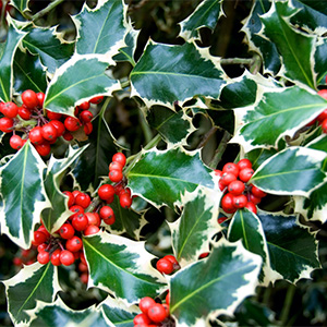
However, the Lunatics have given me the space to talk about my least favorite color combination. Red and Green. There seems to be a hidden need for humans (at least in America) as December rolls around for us to put red and green together. Is it a love of holly bushes with red berries to fill the color void as the spectacular fall colors have disappeared? Is it the hidden human drive to combine complementary colors to add pizzaz to our lives? Maybe in the Northern Hemisphere we are all fighting the doldrums that having less daylight creates, and we need that visual punch occasionally. But, even trying to understand why it is popular, doesn’t make me like the combination any better.
In woven fabrics, the places where red and green intersect turn brown, and that muddies up the design. Or the woven pattern disappears because the proximity of the red and green yarns causes my vision to vibrate, and it is unsettling.
Love this Draft!
Whatever the reason behind the human desire to combine red and green. I have a strong dislike of it.
Let me show you what I am talking about.
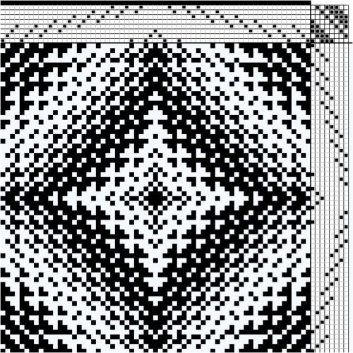
Take this lovely snowflake design: The 8-shaft pattern has a lovely symmetry and makes wonderful fabric. It is shown here with a black warp and white weft for clarity. This draft is slightly modified from Kim Marie Bunke's article from the Best of Weaver's Twill Thrills Book page 52.
And this one too!
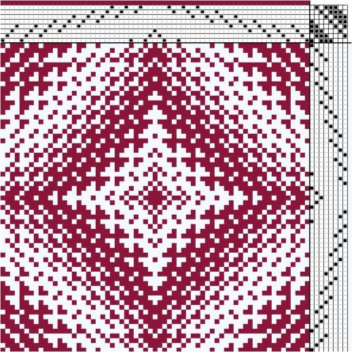
Now, add a gorgeous cranberry red warp to the draft and weave it with bleached white weft. A lovely clear design emerges. Lovely and just right for Valentines Day. Whoops, wrong holiday!
But this one? Not so much!
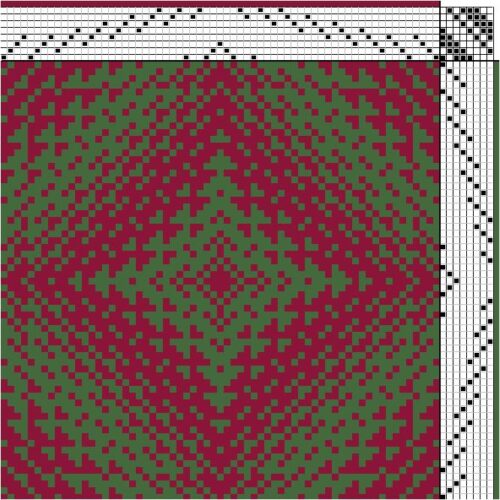
Ok, add green to that draft, and I lose interest. Here is the draft with Thyme weft with the Cranberry warp. I used the hex numbers for our Tubular Spectrum yarns to get a good approximation of the actual yarn colors. Here is a link to a chart that has those hex numbers.
The yarns have about the same values, and I really don’t like that design. Too much vibration. Bah Humbug!
Ok, red and green don’t have to be ugly!
In general, I tend to say Bah Humbug to Red and Green Designs. However, some lovely weavers that I know have set out to prove me wrong.
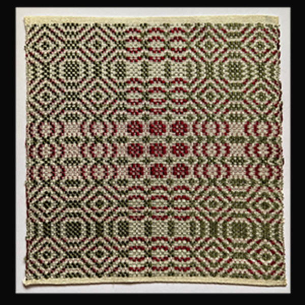
My Dad wove this snowball design with plied silk warp and tabby, and tram silk pattern weft. He likes to weave miniature overshot patterns, sett at 48-72 ends per inch, to put on cards. The tabby is the same creamy color as the warp, and the pattern weft is green and red…no color blending required. So, Red and Green were used effectively in a design without the vibration.
I love this card.
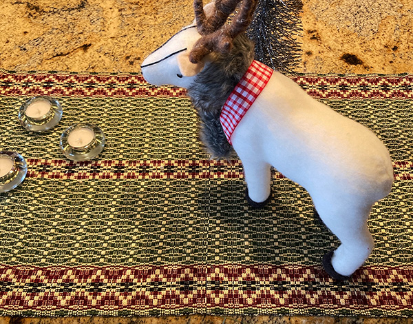
Jenni J., a very talented weaver from the Boise Valley, wove a set of wonderful overshot runners and matching mats using red and green very effectively. The rich red and green are stunning!
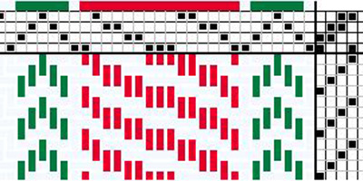
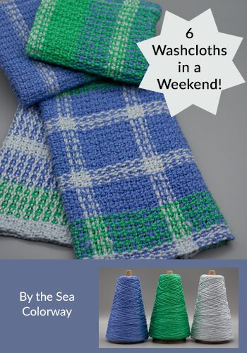
And I do like all the adorable 4-8 shaft candy cane towels that everyone is weaving right now. Very cute use of red and green and visually appealing. Here is a 4-shaft draft of the twill.
With these patterns around, I know that visually appealing red and green patterns do exist! I will keep looking…


I agree with Katzy and the comment. Red’s and greens have similar ‘dark’ value (reflected light). Even, or especially, the holy bush puts a highly reflective cream color between the berries and leaves. How about a gold or cream colored thread between the greens and reds. Might have to change the draft.
John
That is a great idea! Could even put in a sparkly yarn like Abigail Gimp!
I am also not a fan of Red and Green, but do realise that sometimes in the right combinations it can be quite nice.
As you mentioned, the values of the red and green in the snowflake draft are too close, plus there are even amounts of both. Your examples of red/green combinations you do like have a darker overall red than green and less red overall. Stronger value contrast means less vibration, and more green than red makes it an accent color. I wonder if you used a paler green in the snowflake draft, if you’d still dislike the combo? If so, then I’d say your preference for cooler colors (blues), mean that you tend to lean more toward red/green combos that are weighted more towards green.
So, it’s not that you hate red/green, just certain types of red/green combos.
I agree with you, by the way. That red/green snowflake is overwhelming. Like the draft though.
I like your analysis! I do tend to like green designs more than red. A paler green might work to offset the red, but it is hard to rescue end for end red and green combinations. I prefer red as an accent color.